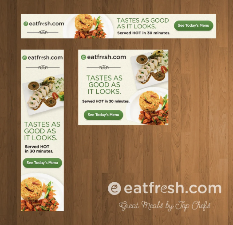
Display ads—in all their forms—are one of the most common advertising tools in today’s online world. Especially with programmatic advertising, where a “set of banners” are optimized for delivery to your target audience across all the websites and devices they utilize.
Banner ads are advertisement images embedded on web pages that showcase a product or brand and link to the advertiser’s website. Most companies use them in one form or another because they are an affordable, measurable, and effective medium to increase brand awareness.
Here are some tips to help you create ads that pack a punch and turn casual browsers into customers.
Highlight Your Value Proposition
Your value proposition showcases your product or service and calls attention to itself with attractive offers and prices. Think things like: “High quality” or “50% off” or “Limited time offer.”
This should take up the most space in your ad and be the first thing that viewers’ eyes see.

Have a Clear Call To Action
The call to action (or CTA) is the text or button that invites users to click. Phrases like “Learn more” or ‘”Get started” or “Watch Now” are great examples.
This should be a clear focal point of the ad.


CTA text examples include:
- Learn More
- Click Here Now
- Schedule Demo
- Download Now
- Try it Now
- Free Trial
- Sign-Up Now
- Watch Now
Depending on the type of banner, buttons will often increase the click-through rate (CTR) of your ad. If you’re going to use them, place them after your copy on the lower right side in (tastefully) contrasting colors. Always keep them consistent throughout the set of ads.
Static vs. Animated?
If animated ensure the CTA persists throughout. The ‘Learn More’ button cannot appear after 10 seconds!
This is great example of animation used well. The “brand” and CTA are maintained throughout while the value props are rotated.

1×1 border around the image to “frame” it and ensure visibility. Gray or black is typical.

Additional Best Practices
- KISS – Keep it simple. The fewer words the better.
- Keep your file sizes small. The smaller the better. Your display ad needs to load fast on a page before viewers scroll down and miss it.
- The best way to structure a display ad is to make your value proposition and CTA most prominent.
- Choose a simple color palette that is conducive to your branding and marketing goals.
- When it comes to typography, construct a hierarchy to make sure the most important information stands out.
- Opt for unique images to grab the attention of fickle viewers.
- Test, Test, Test! Vary the CTA Text or Value Prop Message or Hero image